
Visit Date: June 2015
LOCATION: London Transport Museum Depot, Acton, London
WEBSITE: http://www.ltmuseum.co.uk
DATES: Second Saturday of the month
COST: £10.00
DURATION: 90mins
CONTACT: 020 7565 7298 bookings@ltmuseum.co.uk
To mark the 100th anniversary of the 'Johnston' typeface the London Transport museum has set up a number of open days to visit the depot and delve into the archives and discover the drawings, manuscripts and development of the iconic Underground roundel symbol.
In 1908, the various underground railway companies agreed to use the collective term 'Underground' and with this in mind a unique shape and image helped distinguish the station name from surrounding ads.


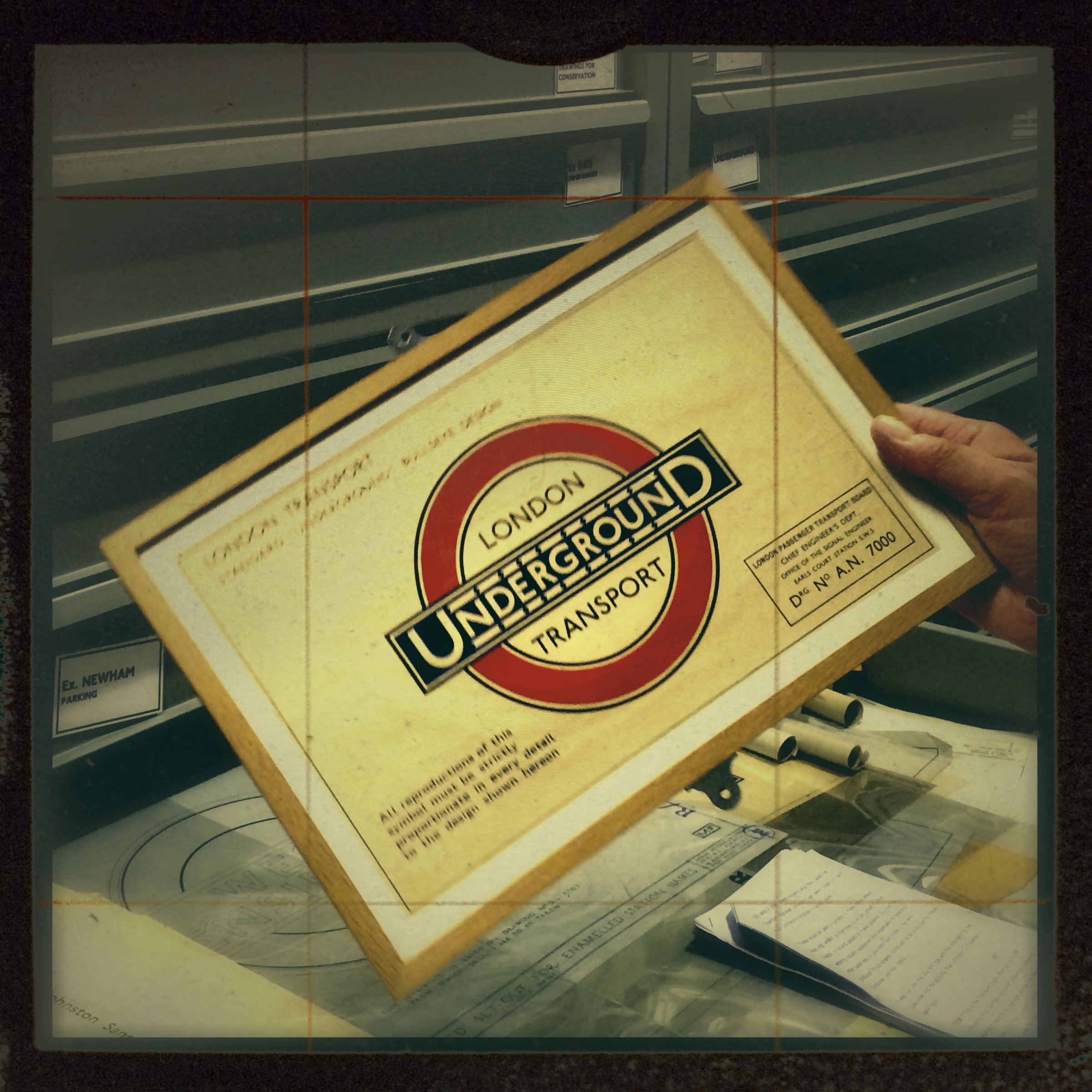
Before too long the London General Omnibus Company registered the 'winged wheel' as its trademark, and in 1912 the LGOC became part of the Underground Group. At this point a new corporate identity to unify and identify the new formed group was required. Although the bar and circle appeared on maps and publicity, other organisations took it upon themselves to develop their own take on this symbol, notably the Metropolitan Railway. This confusion and lack of clarity presented a problem, and in 1913, the Underground's publicity manager Frank Pick not only took it upon himself to consider every element of design, architecture, typography, and placement, in fact the overall image was dictated by Pick. As part of this process, Pick wanted a typeface that would ensure that posters and signage weren’t mistaken for advertisements. Before Pick, advertisements and posters were placed randomly anywhere and everywhere. Stations weren’t properly marked, causing a considerable amount of confusion. He therefore decided to commission Edward Johnston to design a company typeface and logo to bring everything in line.


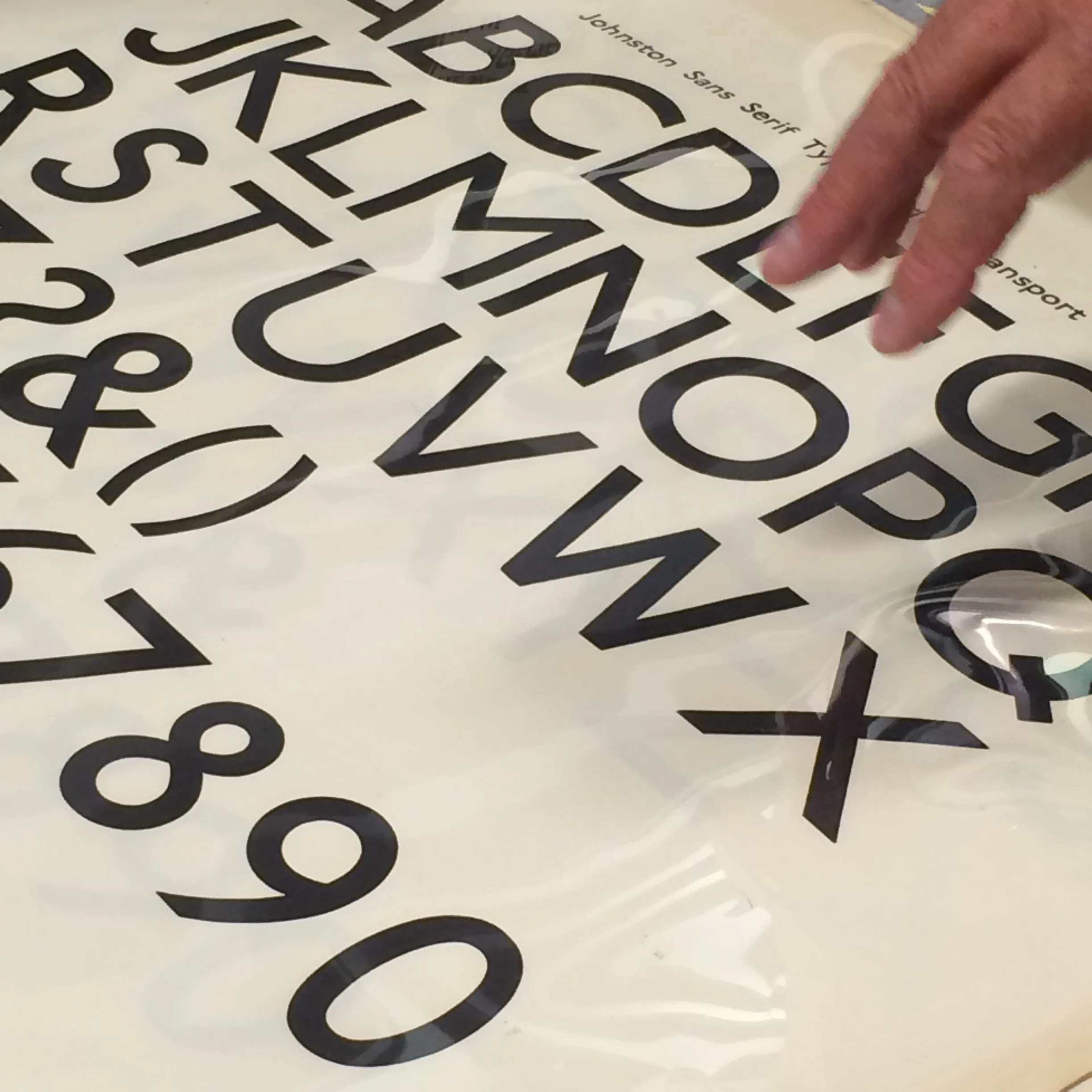
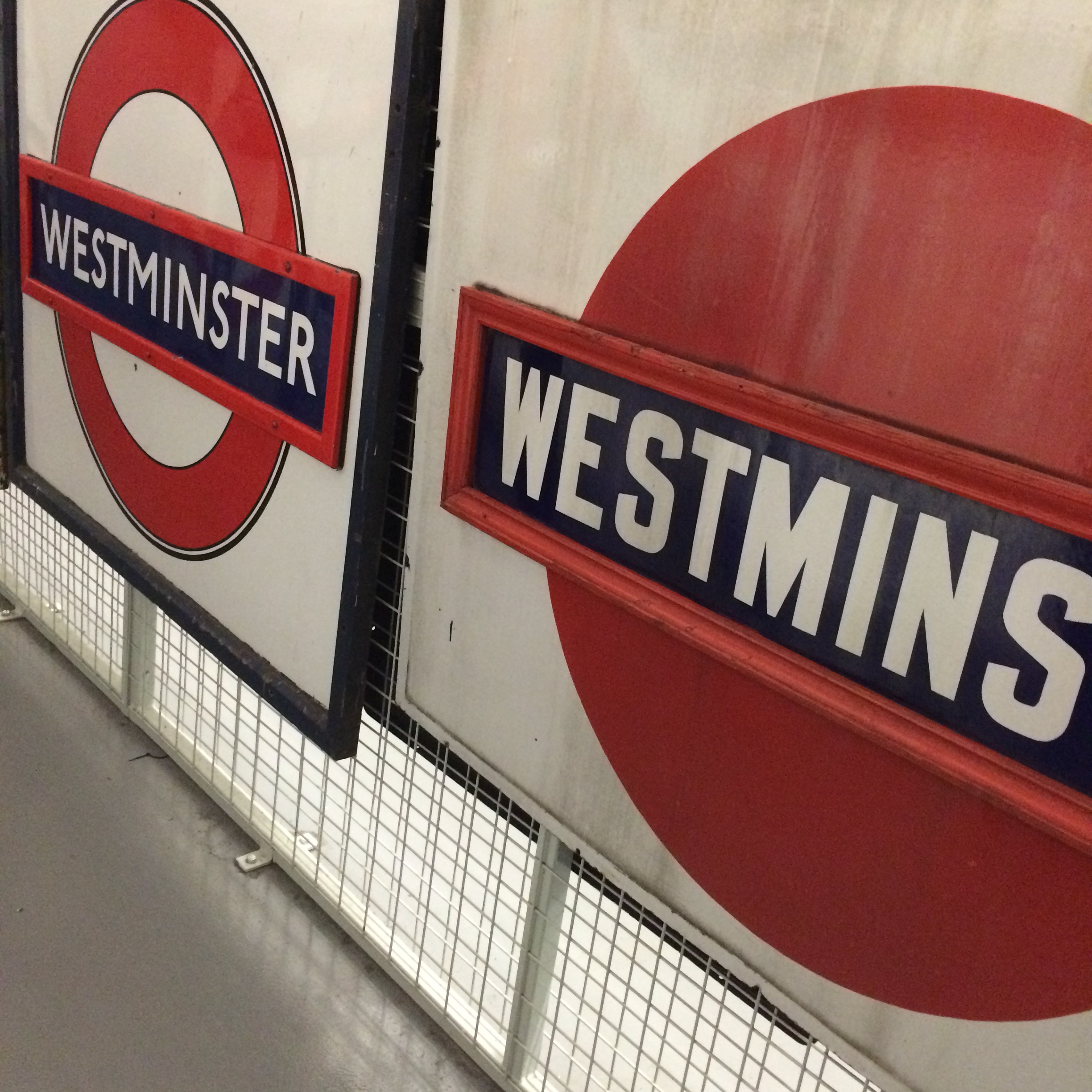
Pick’s requested bold letters, that were both classic, modern and above all functional. The Underground typeface (now known as Johnston Sans) is based on ancient Roman letter forms, but the lack of serifs and clear legibility make it unmistakably his vision for the 20th Century. In fact Johnston Sans was so successful a version of it is still in place today. As both the font and roundel were being developed, Johnson experimented with size, placement and arrangement in order to ensure that every station was immediately recognisable and easy to navigate. The now famous red circle and blue bar was registered as a trademark and by 1919 the standardised roundel was beginning to appear on station exteriors and platform name plates.
Guidelines, proportions and a colour palette were being developed for all manner of material to further endorse the level of both communication and information.


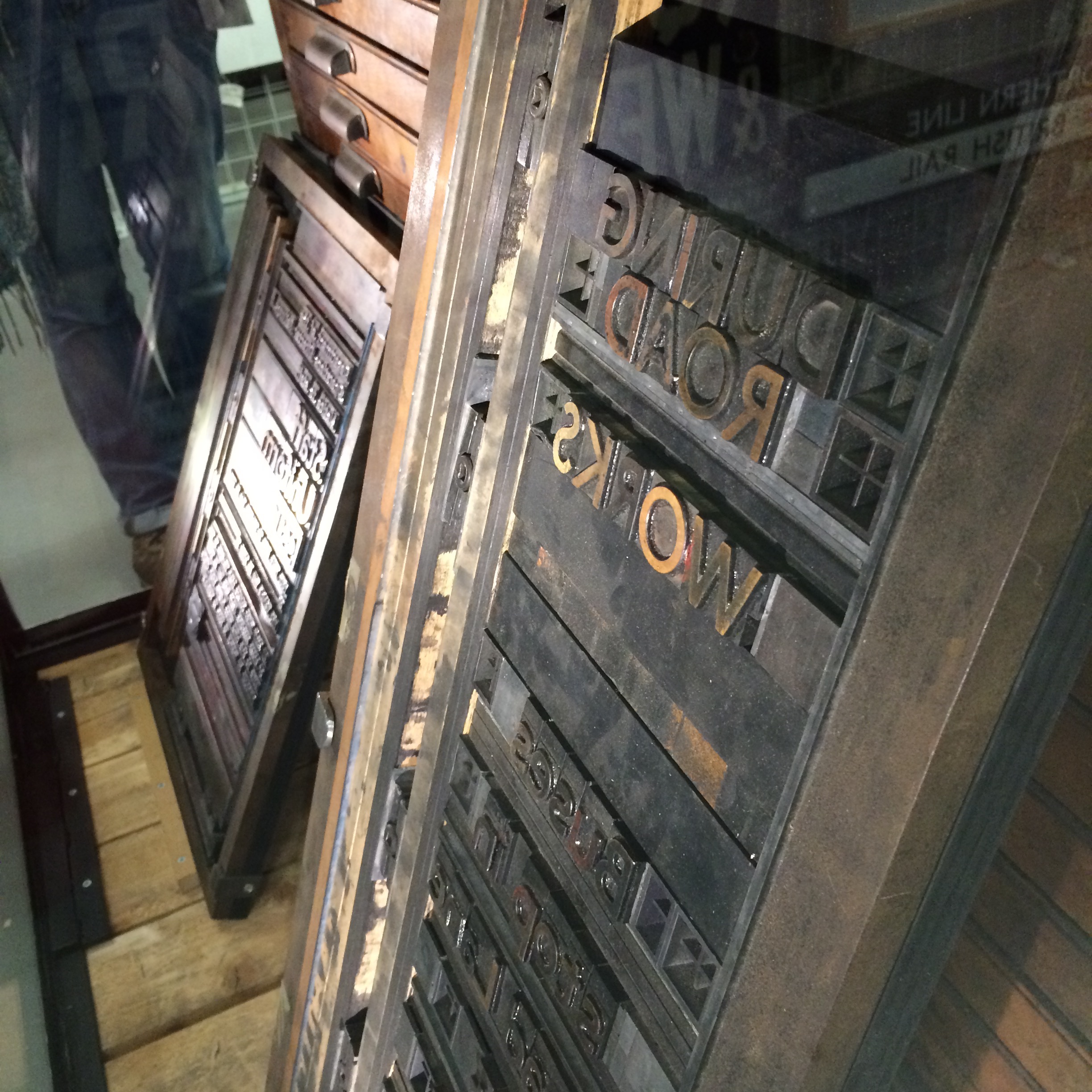
Selected printers required the font designed by Johnson to implement Pick's vision of consistency and uniformity. Once the font was drawn up, the painstaking process to develop the typeface for printing started. Not before too long, each printer received both guidelines and a mammoth wooden chest with Johnson's font.


During this time the infamous Underground roundel was being adopted by other modes of transport in the group.


Over the years Johnson's roundel may have been finely tuned but essentially it remains the same, and in the depot they catalogue and display all the signage which we now pass without any thought regarding its design and development.


All manner of signage was considered, even the destination tapes on buses was considered and brought into the fold, in fact even today it is agreed that destination tapes remain and (at the moment) will not alter to the dot matrix font favoured by other national companies. However, over the years one or two directional signs have slipped through the net - bottom right.


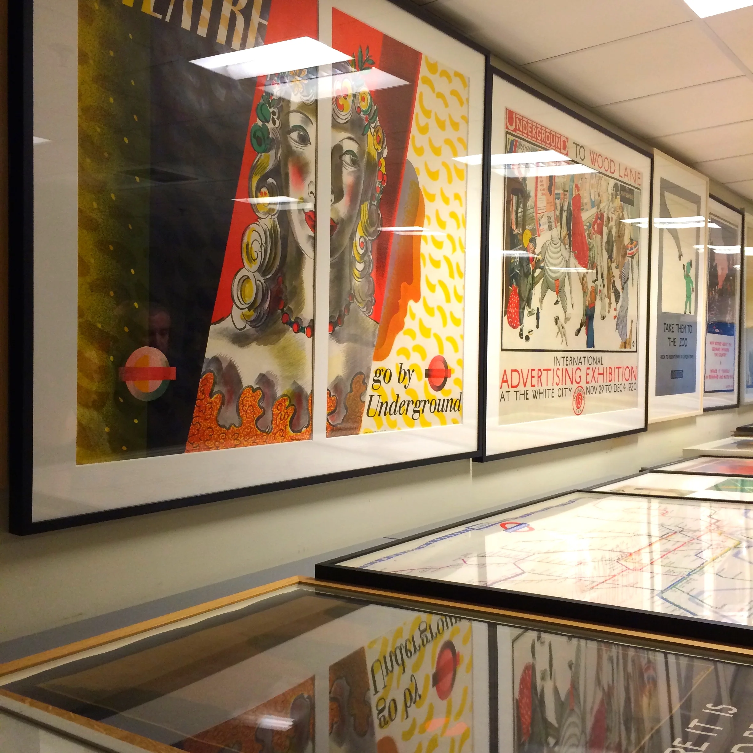
The tour moves onto a rather dark and austere part of the depot, but probably one of the most fascinating. We are lead into a room full of plan chests, the lights to spark into life and reveal all the original artworks of the various posters that have not only won numerous awards but have been at the forefront of creativity over the years. Think the Advertising Standards Authority may have one or two things to say about a few of the ads below...


Our tour continues with our guide showing how things have moved on from the huge wooden chest supplied to printers. More recently selected design groups not only received cds with the corporate guidelines but in fact nowadays they receive a password and can download all the material they require via the web in a second.


In conclusion, this is a fascinating tour into London Transport's history and heritage, the guide was both informative and knowledgeable. Other guided tours celebrating the London Underground include Hidden Underground stations,the Underground Art and Poster store tours, inspirational for any illustrator no doubt, Underground Architecture, and of course the Depot itself.